Have you ever bought so much makeup that you misplaced them or gave up and accepted that they were lost forever? That’s what I have done with this palette. Almost wondered if I even bought it at all. But then while I was cleaning, more like searching for what’s in my bed, and I found this palette! I love the colors and this palette from City Color Cosmetics totally caught my eye! It’s literally a summer palette.
This palette is $13.99 and an online exclusive. I believe I got this when they were having a sale with some other stuff. So let’s jump right into this summer palette!
Poolside:


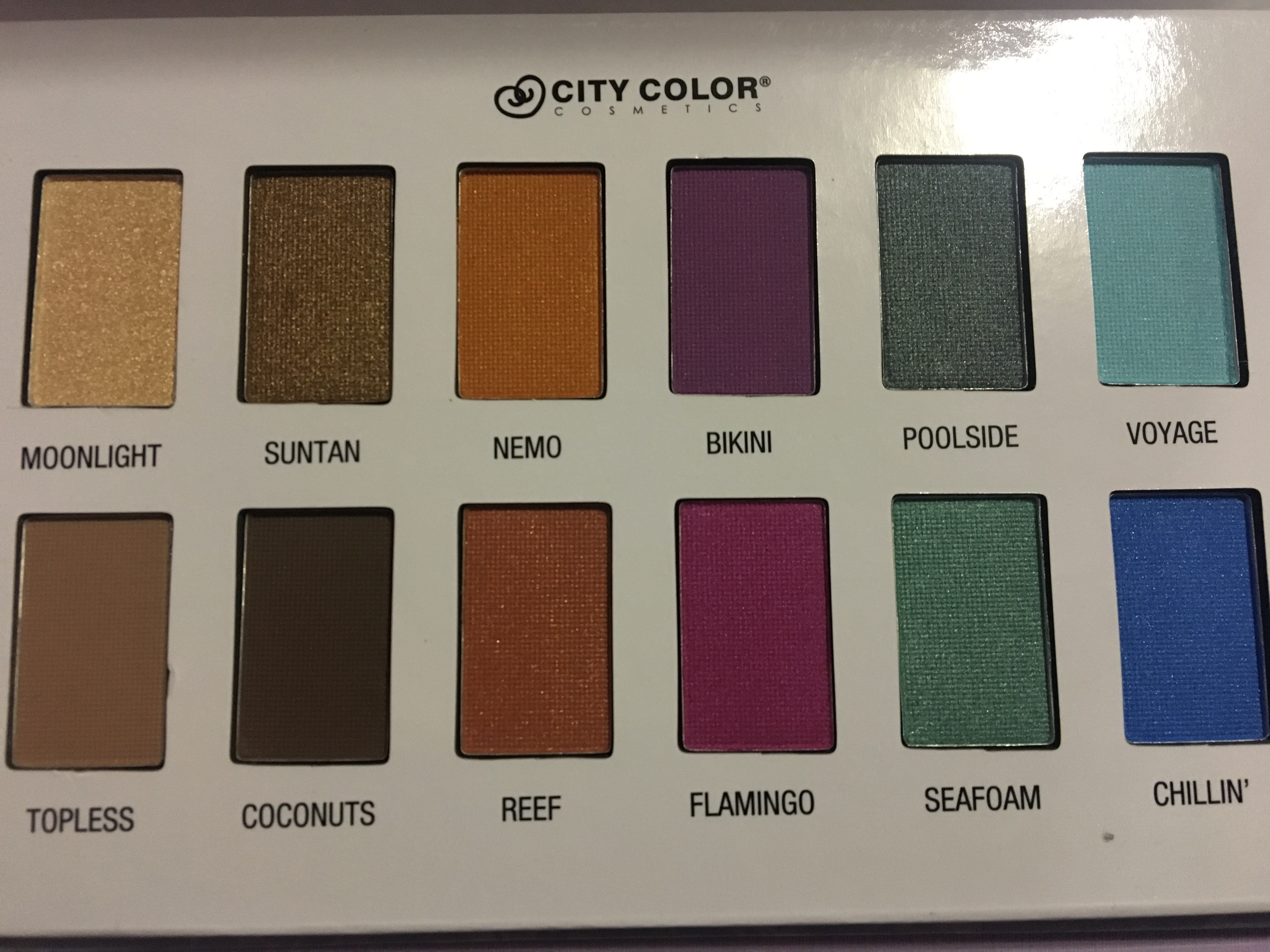
The first row:
 There definitely were some hit and misses in the palette. I will go in order from top down.
Moonlight is a really pretty champagne color. Great for inner corner highlight or all over the face highlight. Super pigmented.
Suntan is also a really pretty shimmer shade. This can also be a great highlight for darker skin tones. Super pigmented golden shade.
Nemo is a light orange shade. It has some shimmer to it but not a lot. This was very difficult shade to work with. I had to go over it several times to show its true color.
Bikini is a really nice orchid color. This was another color that was difficult to show its true color. It’s softer than Nemo but still had to go over it a bunch of times.
Poolside is a metallic teal shade. I really love this color. Very pigmented and not hard to deal with at all.
Voyage is a very pretty light blue shimmer shade. Super pigmented and easy to work with.
The second row:
 Topless is literally a light nude side shade. You can barely see it on my skin. It’s a matte shade and it was pretty hard to build up on me. This would be an all over shade/ neutralizer.
Coconuts is more a taupe brown shade. This another matte shade. It’s very neutral and light on me and I really have to work on building it to be a deep shade.
Reef is a metallic orange shade. It’s really pretty and pigmented.
Flamingo is a really pretty magenta shade and has a purple shift to it. It’s really pigmented.
Seafoam is a metallic seagreen. It’s very pigmented shade. It kinda pills up and you have to even the shade out.
Chillin’ is a true blue metallic shade. It’s very pigmented but also pills up. You really have to spread it out evenly.
Overall there were some hit and misses to this palette. I haven’t used it yet so it may preform differently with a brush and primer. And I’d probably use a white base just to make sure some of the more difficult bright shade showed up better.
Over all I really like this palette. I love the packaging and the idea of it. It’s a hard cardboard with a magnetic closure. The part wear the shadows sit are but boring. If they maybe carried out the reflective water print there or even an all blue shade. Either, it’s a really pretty palette.
I hope this helps you when you’re shopping online! Thank you guys so much for reading and stay purple.

I love the pigment of these eye shadows! Xx
LikeLiked by 1 person
Thank you!
LikeLiked by 1 person